It’s always interesting to see what the Pantone colour of the year is as it does tend to affect future trends and designs. Many interior designers take inspiration from this colour and they also gather ideas about what the colour means and then play on this vibe.
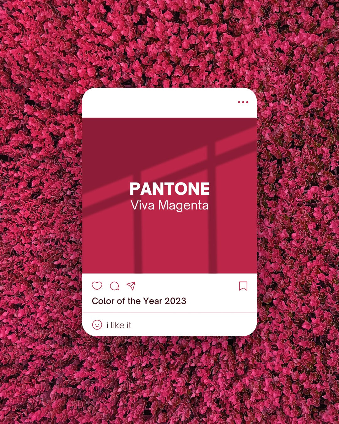
This year the Pantone’s Colour of the Year is Viva Magenta 18-1750. It is said to be a colour that vibrates with vim and vigour and is a shade rooted in nature descending from the red family. Pantone described it as “a colour that is brave and fearless, and is a pulsating colour that promotes a joyous and optimistic celebration”.
We haven’t seen a shade of red show up on Pantone’s popular colour trend announcements for eight years so this is definitely one that we can sink our teeth into. Its colour is all about being powerful and encouraging self expression which will no doubt lead to many bold statements being made in the design world.
So what can we pair this colour with?
Well there has been a few suggestions in the design world which we will share with you now:
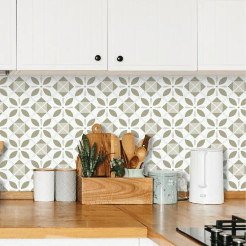
1. Pair with other pinks and reds to create a rich and delightful aesthetic or create a contrast using lighter tones and let the bold magenta stand out. Try our new Mallard Green sticky back plastic as a complimentary colour.

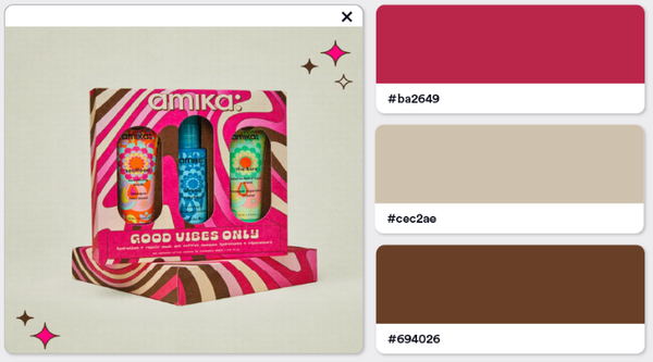
2. You can also blend the powerful magenta with earthy tones such as beige and browns to make a contrast and slightly retro look. Try our new Sand matte sticky back plastic or our new earthy deco wallpaper
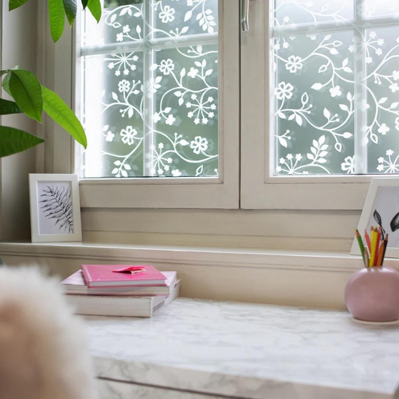
3. It can also be mixed with soft pinks to give that romantic pairing or bright neon for that bold a vivacious look. Either way the flexibility of this colour is undeniable.

In Your Home
If you are in love with this colour then why not take a look around your home and see where it could be slotted in to give your place a bit of a wow factor. Be it a flash of colour or some furniture we dare you to be bold and make a statement!
Take a look at our complete range of colours and vinyl products at https://vinylhome.co.nz/

