Colours and emotions
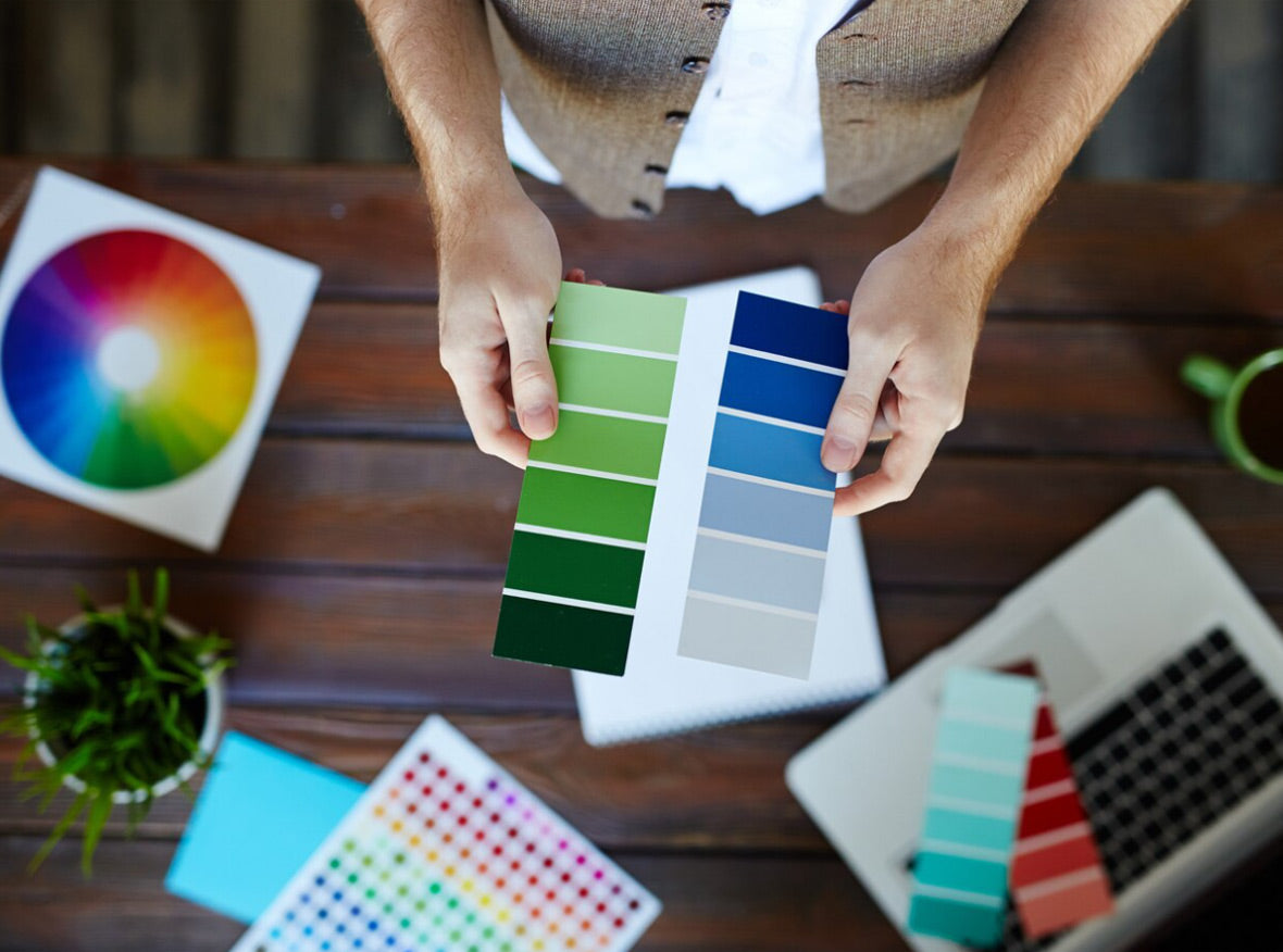
Interior designers have long believed that colour can dramatically affectmoods, feelings, and emotions. So it’s important that we set the right tone in our home when we are looking at renovating.Warm colours like red, yellow and orange evoke emotions, such as love, passion, happiness, and anger. Cool colours, like blue, green and purple are linked to calmness, relaxation and creativity and neutral colours such as white and cream are associated with warmth, humility and comfort.
What is a Pantone Colour?
Pantone is the world-renowned authority on colour, producing a standardised colour system that allows individuals to reproduce colours exactly, regardless of their equipment or location.There are over 3000 Pantone colours today and it continues to grow year on year.
Pantone is also recognized globally for its colour expertise, with the company releasing a Colour Trend Forecasting report on an annual basis. In this report, Pantone identifies the colours which industry professionals can use to tap into consumer trends for the year ahead, as well as the much-anticipatedColour of the Year—a colour or colour duo chosen by Pantone’s colour experts as a particularly on-trend hue for commercial design in the coming months.
Colour Trends for 2022
This year’s predicted colour trends are meant to reflect optimism, growth, renewal and a sense of positivity.Like previous years, many of the colours of 2022 are again rooted in nature. Pantone’s colour of the year is called Very Peri and is said to have a courageous presence which encourages personal inventiveness and creativity. Etsy’s colour of 2022 is Emerald Green and is said to reflect nature by representing harmony, growth and refinement.
But the range of colours that we think are interesting are the Spring Summer collections from Pantone featured below. Fun, vibrant and a perfect way to add some colour into your life.

Popcorn -Bright and cheery Popcorn radiates warmth to all who embrace it.
Cascade -Connected to cleansing waters, dreamy Cascade cools and refreshes.
Coffee Quartz -A flavourful brown that touches on both the basic and the glamorous.
Potpourri -Potpourri is a lighthearted and carefree fresh pastel pink.
Coral Rose -Vivid Coral Rose is a floral tone whose energising presence brings a sense of excitement.
Fragile Sprout -Sharp and acidic, Fragile Sprout is visually arresting.
Orchid Bloom -Reminiscent of our heightened love for nature's florals.
Bubblegum -Eye-catching Bubblegum sends a message of playfulness and positivity.
Sudan Brown -A naturally rich earth-baked brown tied to the great outdoors.
Super Sonic -Vibrant Super Sonic is electric in intensity.
Bringing Colour to your Home
Adding a splash of colour to your home can not only add some personality into a room it can be seen as a feature that draws the eye and creates an impact. These colour trends can be seen through a range of our latest products and combined with some more neutral colours can really make a difference.
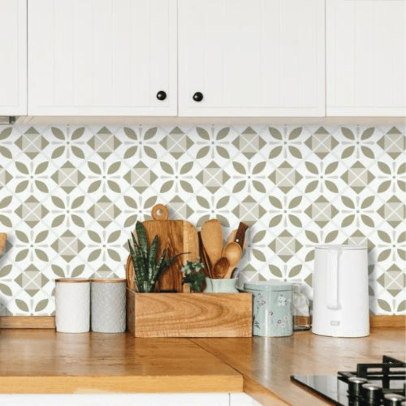
Metro Wall Tiles are available in a range of colours including similar shades to the Spring/Summer Trends.


We also have different shades of blue that will compliment any Supersonic colours. Our new Penny Davy wall tiles come in shades of blue that look great paired with wood and stone or bright colours and our Metro Ezra tiles.

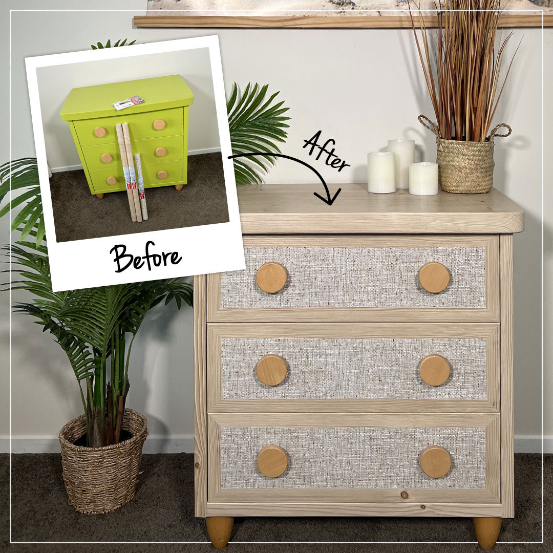
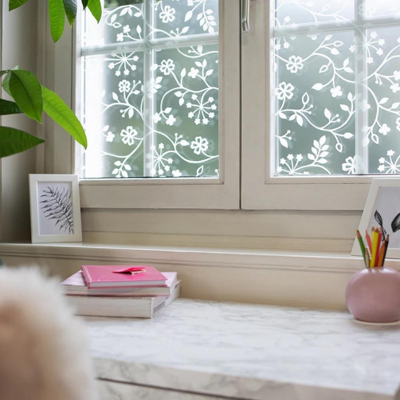
And of course our wood grain sticky back plastic is a great match for the Pantone Coffee Quartz and Sudan Brown.


To see our whole range head over to our websiteand add a splash of colour into your home this year. ANd if you are a new customer don’t forget to subscribe to our database and you will get 10% off your first order! Happy Renovating!

